Double Matting: Your Expert Guide to Accent Mats
Double the mats, double the fun!
If you’re new to custom framing, you may not be familiar with double matting. The process involves layering one mat on top of another so that the bottom mat (also called an accent mat) forms a decorative border around your artwork. Double matting is a pretty simple concept, but it has a big impact on your display! It’s a technique that can add contrast, depth, and a pop of color to your finished custom frame. There are several options when it comes to accent mats, so we’ve explained the different ways you can make them work for you. Just follow our easy double matting tips to turn a simple frame into a stunning statement!
Why do mats matter?
While there are some instances where full-bleed (no mat) framing is preferable, in most cases, we suggest using mats as an affordable way to create an impactful display. Mats draw the eye in and lend gravitas to art; they can add contrast, drama, and a pop of color. The right mat choices will enhance your artwork and help achieve visual balance. Choosing the ideal mat size, layout, and color really does make all the difference in your finished custom frame!
Why choose an accent mat?
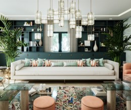
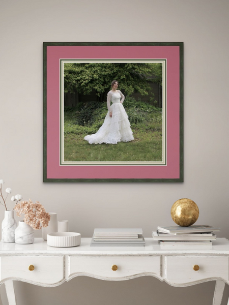
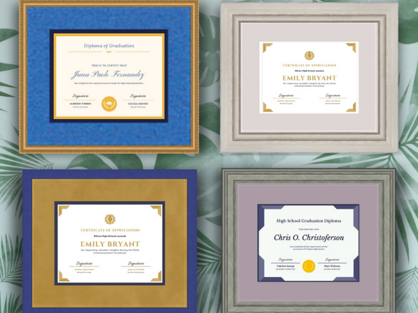
Accent mats do everything that a main mat does—but you get double the impact! Double matting is a custom framing speciality that can’t be bought at big box stores, so it gives your piece an even more deluxe, bespoke look. Accent mats add depth to your display and can impart a more formal look. They’re also a great way to add a pop of color or highlight undertones from your art. Keep in mind you can use multiple accent mats, so there are many options for complementing your artwork!
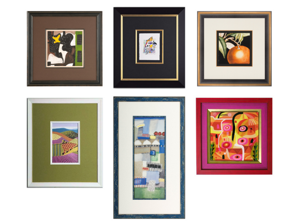
Choosing main mat colors
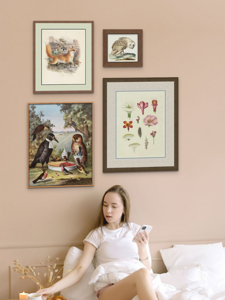
Pinpoint the undertones in your art by noting which colors are the third or fourth most predominant. You can choose a mat color that highlights the undertones in your art (but avoid anything too flashy unless you want a very bold look). You can also pick a tan or gray neutral mat that complements the undertones in your art. Some simpler options that work for most artwork and decor styles are white (crisp, modern), ivory (traditional, vintage), or black (dramatic, moody).
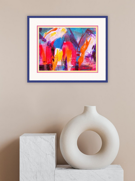
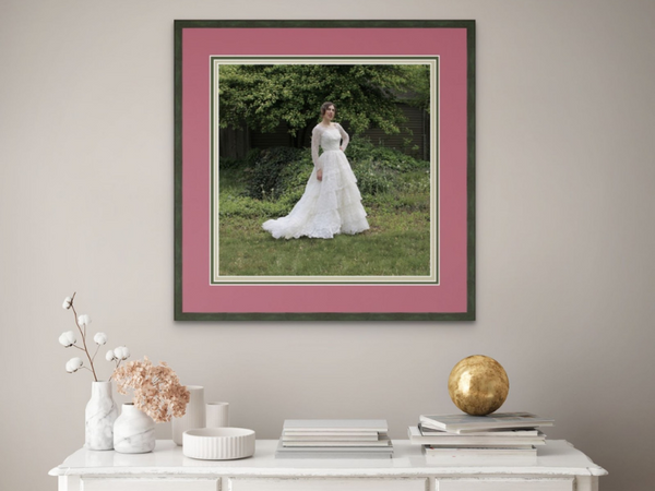
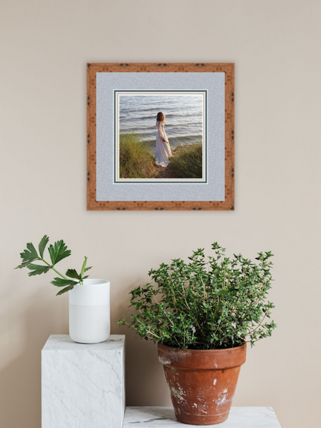
Choosing accent mat colors
When working with multiple mats, it’s common to use a lighter tone for the main mat and a mid-range or darker tone as the accent mat. (Keep in mind this is only a general rule and rules are made to be broken!) If you’ve chosen a neutral for your main mat, your accent mat can add a layer of color while highlighting undertones from your artwork. You can also layer neutrals to great effect. If your main mat is a color, a color accent mat can take the look a step further. If a bold hue is ideal for enhancing your artwork, an accent mat delivers a small dose of color that won’t overpower your art.
Classic combinations:
-
School colors for a diploma or tassel
-
Team colors for sports memorabilia
-
Two neutral mats to soften the composition or provide contrast
-
Neutral main mat + color accent mat to highlight a hue from the artwork
-
Neutral main mat + metallic accent mat for a luxe look
-
Two color mats in different shades of the same color (monochromatic)
Choosing mat sizes
In most cases, you want your main mat to be at least 1” wider than the width of your frame (most mats are 2-4 inches wide). Generally, larger artwork supports a wider mat and smaller artwork is paired with a narrower mat. However, you can choose an oversized mat if you have a smaller piece and you want to make a big impact. ¼” is the standard width for accent mats and it’s the size we usually recommend. You can opt for a wider accent mat (generally in 1/16” increments) if it better suits your piece.
Other considerations
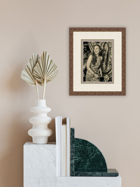
If you’re looking for a way to make your display extra special, consider using a specialty mat. It’s a great way to add texture and make a statement! Choose from unique finishes like linen, suede, foil metallics, and more. Something else that’s good to know: mats can have different core colors. The core color is the interior hue of the mat—you see it on the beveled edge where the mat has been cut. The most common core color options are cream, white, and black. It’s a small component of the matting, but it can still make a difference, so keep the core in mind when making your mat choices.
Explore all the double matting options at your local FastFrame store! Looking to learn more about mats? Read Mats Matter! How to Choose the Perfect Mat.