Mats Matter! How to Choose the Perfect Mat
The right mat choice can truly enhance your artwork. Mats draw the eye in and lend gravitas to art; they can add contrast, drama, and even a pop of color. Choosing the ideal mat size, layout, and color makes all the difference, but the options can feel overwhelming! We’ve created a guide to help you navigate the world of mats and empower you to custom frame with confidence.
Choosing a Color
If you’d like to pick a color mat, take a good look at the hues in your artwork. Which colors do you notice first? You don’t want to choose a mat that matches the most predominant color in your art, as that hue already stands on its own. Instead, you want a mat that draws out the third or fourth most predominant color. This will highlight the undertones in your art and achieve visual balance. If you’re confident with color, you can bend these rules a bit, such as choosing a subdued mat in the same color family as the predominant color.
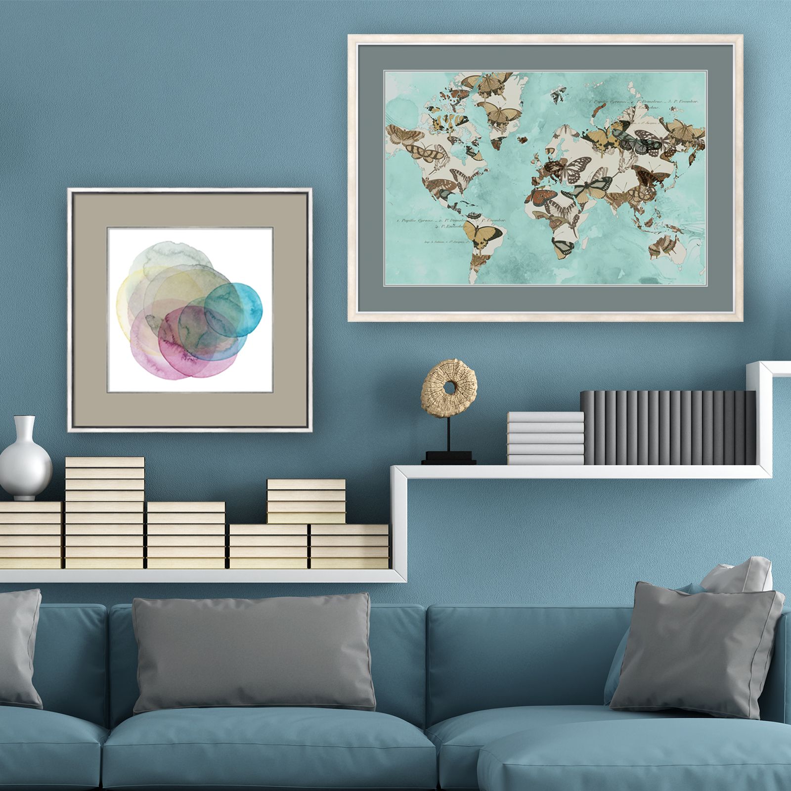
Just remember that a mat’s job is to enhance your art, not the other way around! Showing too much of a bold color may make the eye focus on the matting and not the artwork, so intense colors are often best left to accent mats.
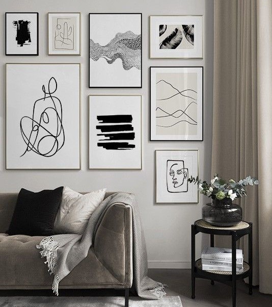
If you’re not keen on using color, neutral mats are a classic way to make your art pop and will fit in with any style. White has a crisp, modern look and ivory feels more traditional, while black adds drama. Tan and grey shades are also great options to give your art more depth without having to worry that your end-result won’t match your decor. Just like with color mats, you should look at the undertones in your art to decide which neutral mat will look best.
Sizing & Layout
The width of your mat greatly impacts how your art is presented. A good rule of thumb is to choose a mat that is at least 1 inch wider than your moulding. Most mats are 2-4 inches wide; generally, larger artwork can support a wider mat, and smaller artwork would be paired with a narrower mat.
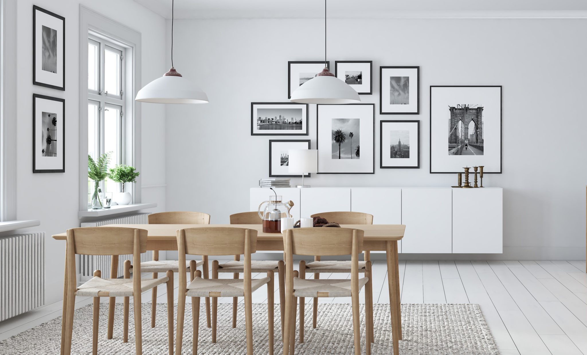
However, if you have a smaller piece and you want to make a big impact, choose an oversized mat. Bigger mat borders have an art gallery look and can help draw attention to your art, especially if it’s displayed on a larger wall.
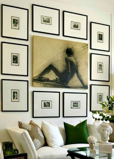
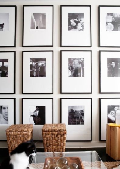
You can also opt to have a weighted bottom, where the bottom margin of the mat is taller than the top and sides. This option will elevate your art and give it a more traditional, sophisticated look. If you have a collection of smaller pieces that would look best as a group (such as ticket stubs or polaroid photos), consider a mat with multiple cutouts so you can display everything together.
A Lovely Accent
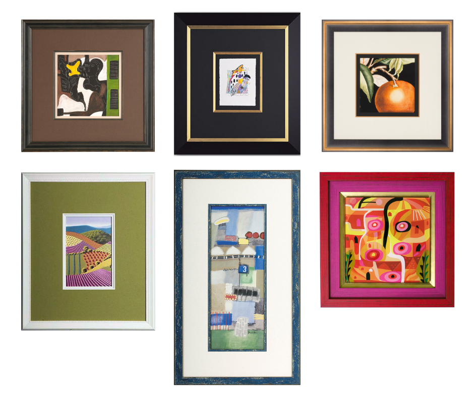
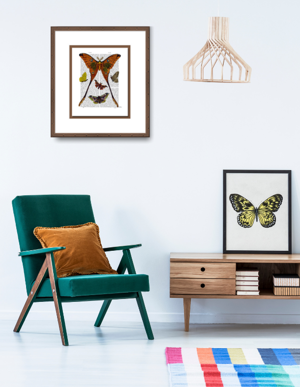
Accent mats are a simple way to enhance your art and give your frame a luxe, bespoke look. When working with multiple mats, it’s common to use a lighter tone for the main mat and a mid-range or darker tone as the accent mat. (This is only a general rule of thumb—your artwork will dictate which combination looks best.) If you’ve chosen a neutral for your main mat, your accent mat can add a layer of color while highlighting undertones from your artwork. You can also layer neutrals to great effect—a black accent mat adds a dose of drama to a soft grey mat.
Even if your main mat is a color, you can still add a color accent mat to take the look a step further. A classic choice is to pair two mats in different shades of the same color—such as light blue and navy blue. Of course, the sky’s the limit for hue combinations, so go wild if you’re extra color-confident! If a bold hue is ideal for enhancing your artwork, an accent mat delivers a small dose of color that won’t overpower your art. Keep in mind you can use multiple accent mats, so there are many options for complementing your artwork.
No Mat, No Problem
As much as we love mats, sometimes your art is best featured without one. Full-bleed framing (also called “straight fit”) is when a piece is framed without any matting, so only a small margin of the art is overlapped by the frame. Full-bleed framing has an ultra-minimalist look and can work well in modern, pared-down spaces. It is especially suited for posters and prints with lots of negative space around the main image. Full-bleed framing is also an optimal choice for large and oversize pieces that are best presented without a mat.
Now that you know the power of mats, you’re going to have such fun transforming your artwork and decorating your home! Be sure to stop by your local FastFrame to speak with one of our designers and browse our stellar selection of mats and mouldings.


