How Much Matting to Use Around a Picture
When it comes to framing artwork, photographs, or any other visual pieces, matting plays a pivotal role in both protection and presentation. The width of the mat can significantly affect the visual impact of the framed piece. So, how do you decide how much matting to use around a picture? This article delves into the nuances of making that choice.
Understanding the Role of Matting
Before determining the width, it’s crucial to understand why we use matting in the first place:
- Protection: Mats prevent the artwork from touching the glass. This is vital because direct contact can lead to moisture build-up, potentially damaging the artwork.
- Aesthetic Enhancement: Mats create a clear visual border between the art and the frame, allowing the viewer’s eye to focus on the artwork without distraction.
- Depth: A mat adds depth, providing a more professional and polished look.
Matting as a Border
It’s important to recognize that when we think about how much matting to use around a picture, we are essentially deciding on the width of the border surrounding the image. This is because the mat fills the border space between the image and the frame.
How Much Matting Do I Need?
“How much matting should I use?” is the question many want answered. However, there are no absolute rules for matting/border width, and it really depends on the desired space around the image. Generally, the more space you allocate, the greater the emphasis on the image.
Contemporary matting tends to have even mat borders on all sides, while more traditional styles might have a noticeably wider border at the bottom.
For those seeking guidance on matting width, some general rules that may help you are:
- Keep the borders even on all sides for a clean look.
- Border widths are mainly determined based on the width of the frame being used. The size of the image can also be considered.
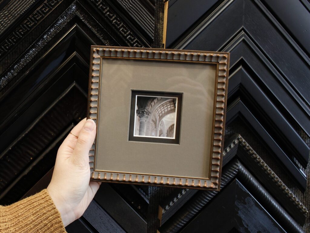
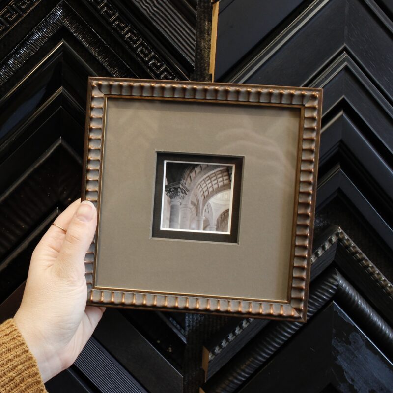
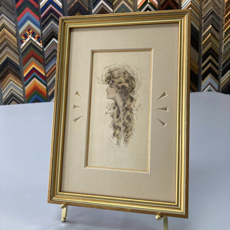
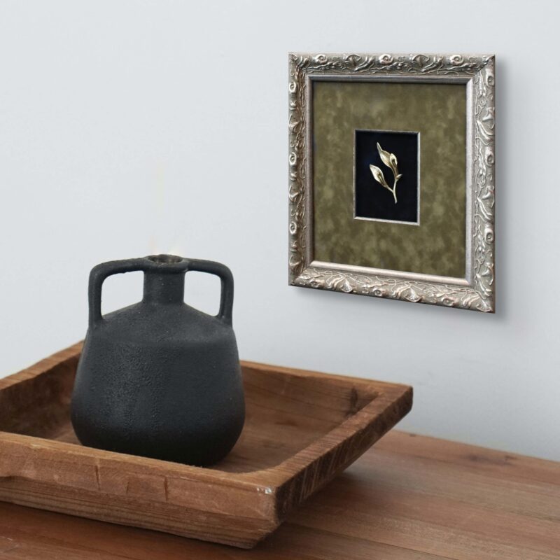
- Each top mat border’s width should be a minimum of ¾” to 1” wider than the width of the frame depending upon the color of the frame. With darker color frames, a wider top mat is often used to create more negative space around the image.
- Smaller images can benefit from larger borders as the border helps highlight the diminutive image.
Balance with Room Decor
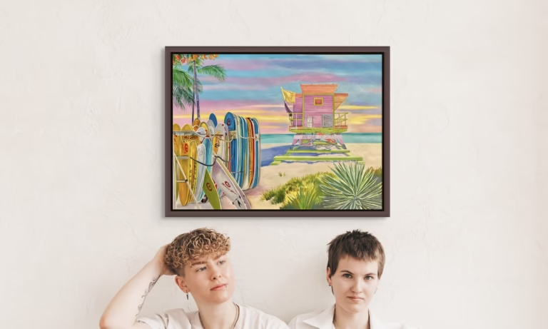
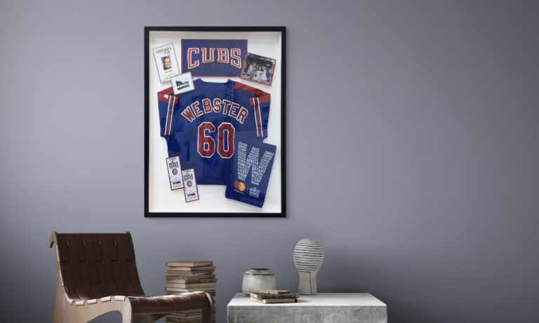
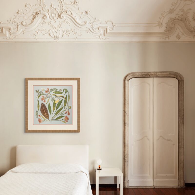
Consider the location where the framed piece will hang. In a spacious room with expansive walls, a wider mat can make the artwork feel more significant and well-suited to the space. In contrast, in a smaller or more cluttered room, a narrower mat may be more fitting. When displaying multiple images, such as on a gallery wall, maintaining consistency in framing styles (like matting size and color) can establish a harmonious look.

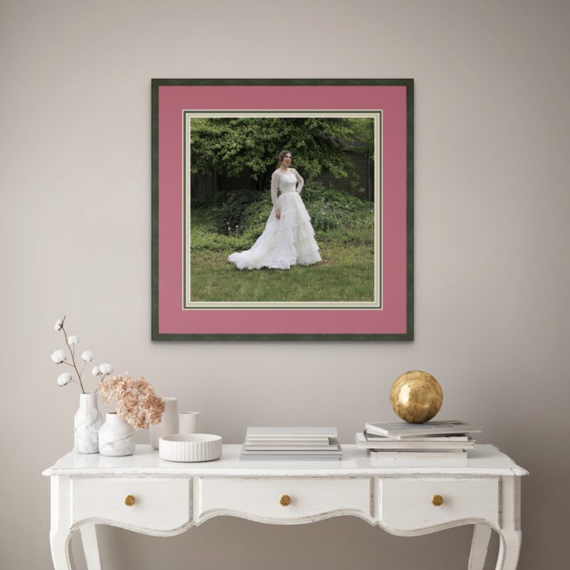
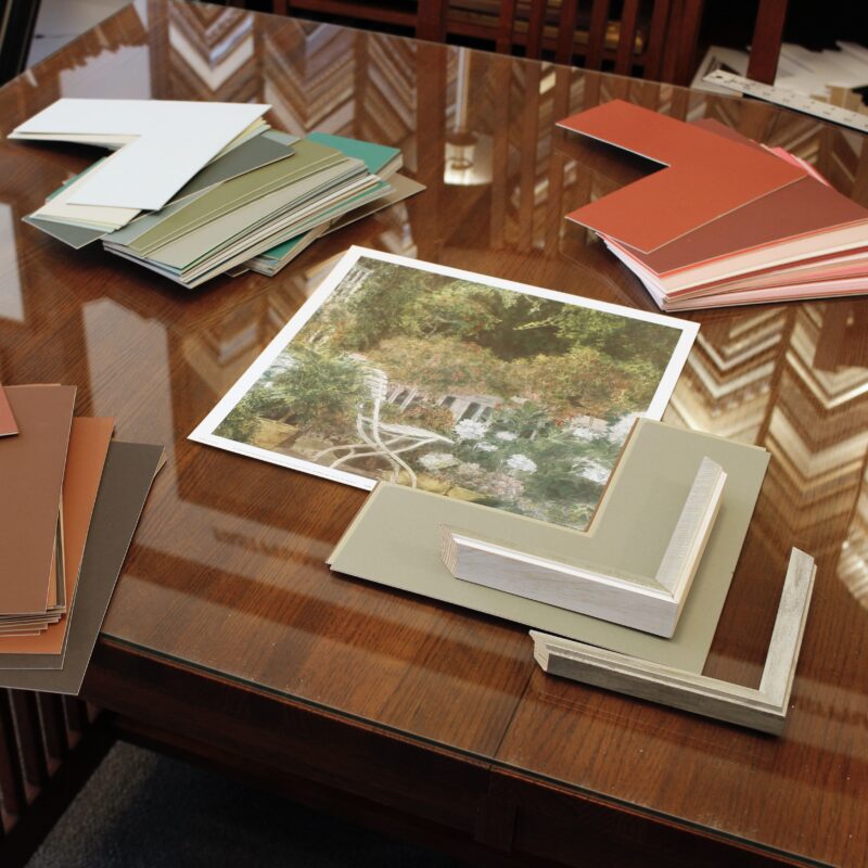
Double or Triple Matting
If you’re using multiple mats, the overall width will change. The width of the layers of matting below the top mat is determined by the color of the layers. More neutral colors can start at ¼” and go up from there. More vivid colors should be used with a reveal of ⅛” mat depending upon the intensity of the color. This layered approach can enhance the depth and intricacy of the presentation.
Trust Your Instincts
While there are guidelines, art remains a subjective field. Occasionally, a specific piece might call for a wider or narrower mat based on its colors, themes, or your personal connection to it. Often, you can confidently select a border width by visualizing the piece in its frame with the chosen matting. For hands-on assistance, visit your local FastFrame store for a complimentary design consultation. Locate the store closest to you here.