[column width=”1/1″ last=”true” title=”” title_type=”single” animation=”none” implicit=”true”]
The most wonderful time of the year isn’t early winter.
It’s mid-autumn, for a whole host of reasons – not the least of which is that it’s an exciting time of the year for color, especially as it applies to home decorating.
Oh, and you’ll never believe which color is the most wonderful at this time of year, 2017. Go ahead. Take a stab. What? You already know?
Well, on the off-chance you don’t already know, it’s….Riverside. At least that’s what the decorating mavens who pay attention to the Pantone Color Institute are saying.
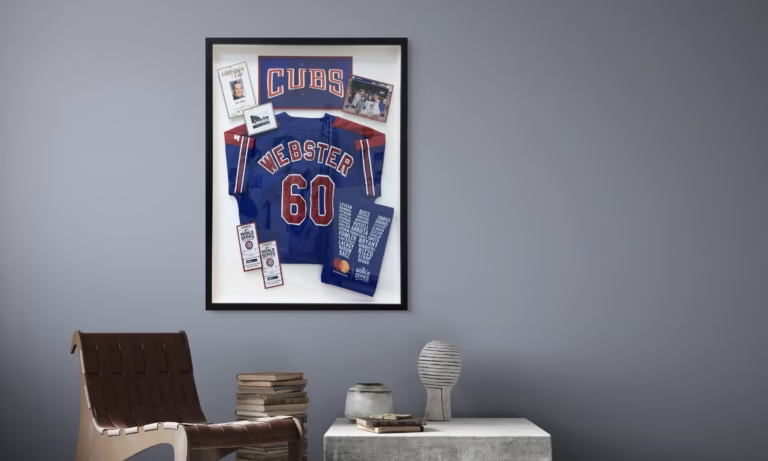
Pantone – the final word on color trends – regularly releases a list of each season’s top colors. Riverside is a shade of blue. It’s said to be like navy (only less stern) and not quite as high-wattage as cobalt.
FastFrame design experts who know their way around color (and they all do) will tell you that Riverside blue is a soothing shade.
You might not think of blue as a fall color (when was the last time you raked a pile of Riverside-hued leaves?), but top decorators assure that it’s as autumnal as it gets because blue connotes a sense of satisfied well-being – the feeling that comes, for example, with having brought in a successful harvest at the close of growing season.
Interesting fact about autumnal blue: one of the accent colors that pairs flawlessly with it is white.
And, of course, there are other colors that make up this year’s fall palette. They include:
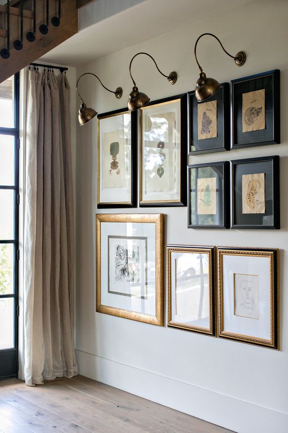
Brown. Style gurus say splashing your rooms in brown will help you reconnect with nature. You don’t need to paint your walls brown and lay down oak flooring or otherwise go to great lengths to sienna-ize your rooms. All you need are brown accents (frames are perfect for this).
There are quite a few shades of brown from which to choose. If you’re letting Pantone be your guide, then the shade that should prove to be this fall’s most popular is Warm Taupe. Actually, any brown will be a great choice, so long as it leans toward the cool side (which, no doubt, is why Pantone isn’t naming any of their colors in this palette Overheated Mocha).
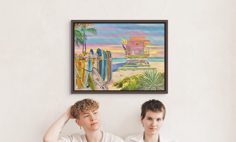
Yellow. It makes sense that yellow would be big, since it’s one of the basic colors of autumn, according to sources close to the trees in your front yard. As is true for brown, it takes only a little yellow to bring a nice autumnal vibe to your rooms.
If you’re not keen on using yellow frames to serve as accents, you might consider using brown frames and placing within them art that employs a significant amount of eye-catching, ebullient yellow.
As for shades of yellow, this season’s top choice at Pantone is Spicy Mustard. It looks like marigold but with an exotic twist.
Orange. Orange adds energy to your rooms. It also powerfully coordinates with other autumn colors – brown, for instance. Surprisingly, Pantone didn’t announce a popular new shade of orange for autumn 2017. Maybe next year it will.
Red. Pantone does, however, have a couple of intriguing new takes on red. The first is Aurora Red, which Pantone says is a sensual eye-pleaser. The second is Dusty Cedar. It’s more of a pink, only warmer – enough so to qualify as a red. Designers favor red for fall because it’s a stately color.
You find all these colors – red, orange, brown – mixed together as you stroll in the woods during October and November, so why not bring them together inside your home to celebrate what would be known as the best time of the year had Andy Williams only sung a different tune.
While you’re out on that stroll, stop in at your local FastFrames store and talk to the design experts for autumn home-decorating tips.
[/column]


