What Color Matting to Use for a Picture
Choosing the right color matting for a picture can significantly enhance its visual appeal, drawing the viewer’s attention to the art and complementing its color palette. However, the sheer variety of available matting colors can make this choice a bit overwhelming. To simplify the process, here are some guidelines to help you select the perfect mat color for your artwork.
1. Accentuate Undertones
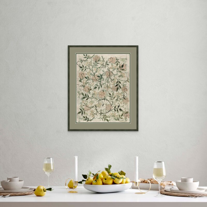
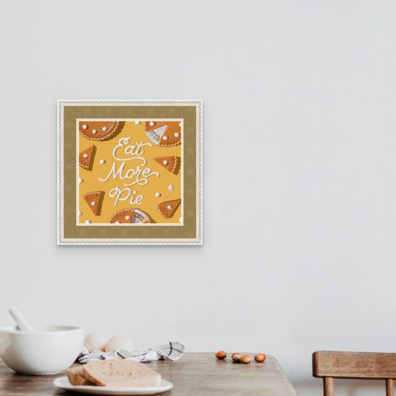
Professional framers often use matting to highlight an undertone from the artwork. You can identify the undertones in your art by noting which colors are the third or fourth most predominant. Using a mat that accentuates an undertone will make that hue pop and help achieve overall visual balance.
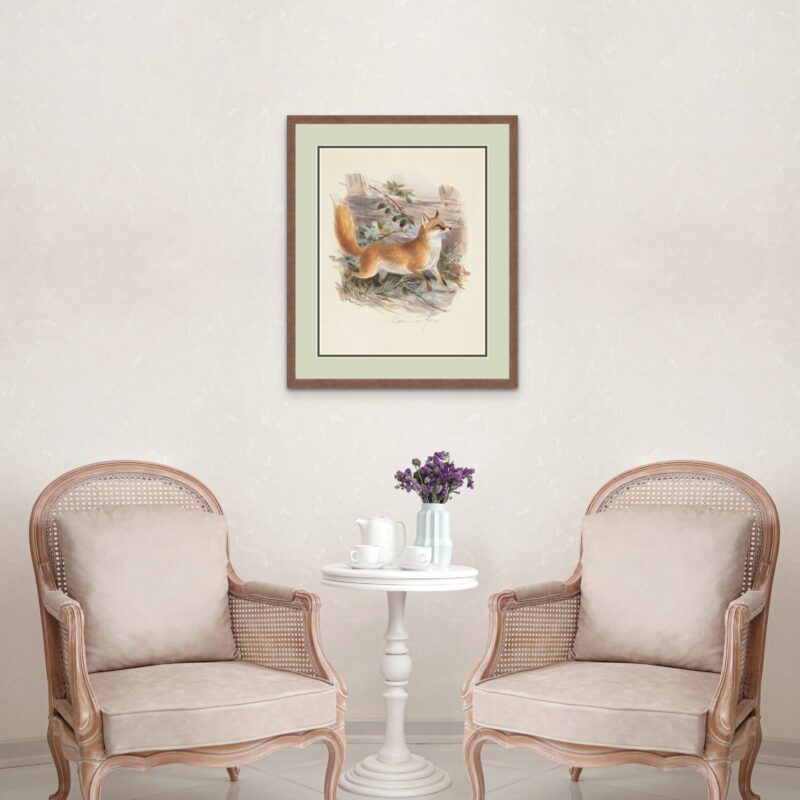
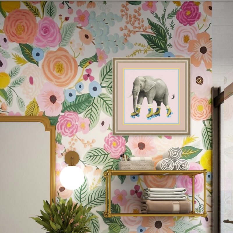
2. Play with the Dominant Colors in the Picture
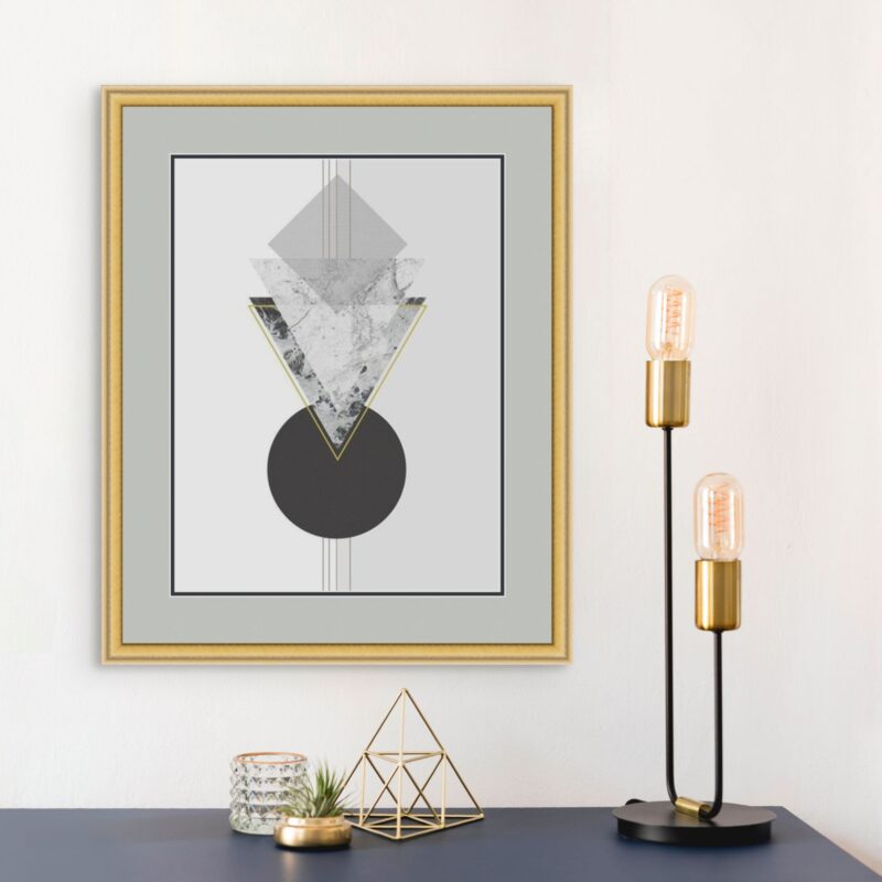
Look at the most predominant hues within your artwork. Though choosing a mat that matches it exactly can be overpowering, you can pick a more subdued mat in the same color family as the dominant hue. This can complement your art without looking overwhelming. (Just remember that a mat’s job is to enhance your art, not the other way around!)
3. Opt for Neutrals for Versatility
Neutral colors like white, black, beige, or gray are timeless choices that generally work well with almost any artwork. White, in particular, can give a fresh, gallery-like feel, while black can offer a stark contrast, making the colors within the artwork stand out.
4. Warm vs. Cool Tones
Identify if the artwork leans toward warm (reds, oranges, yellows) or cool (blues, greens, purples) tones. Selecting a mat that mirrors these undertones can enhance the overall mood of the piece. For instance, a sunset painting with warm hues might benefit from a soft peach or terracotta mat.
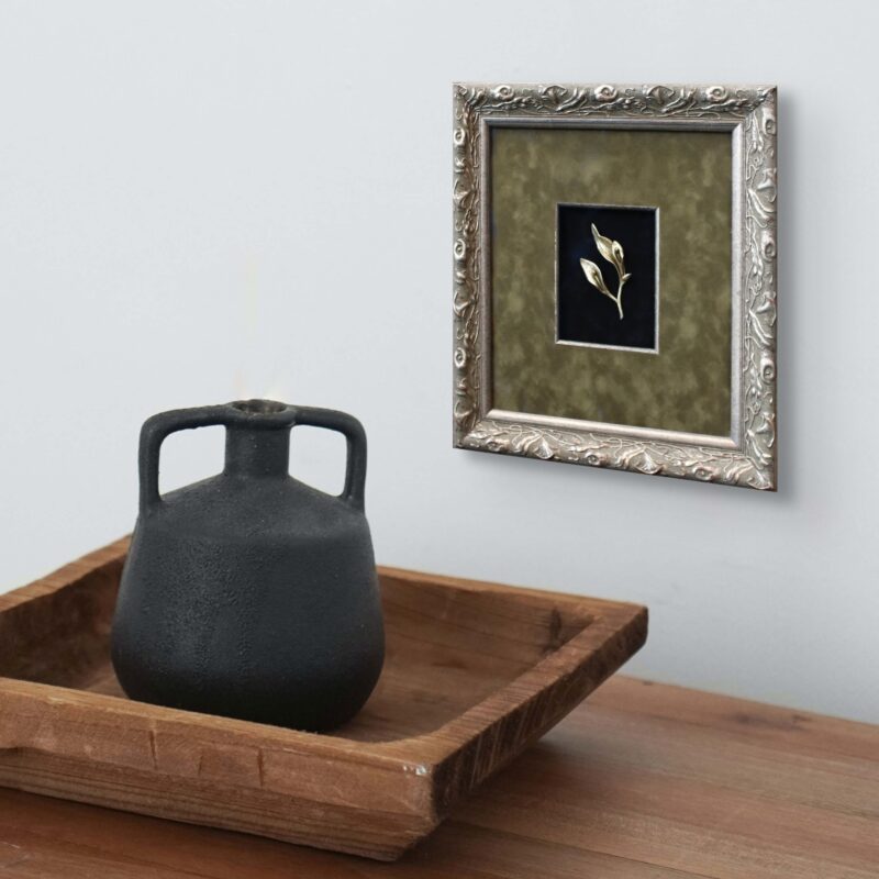
5. Factor in the Frame
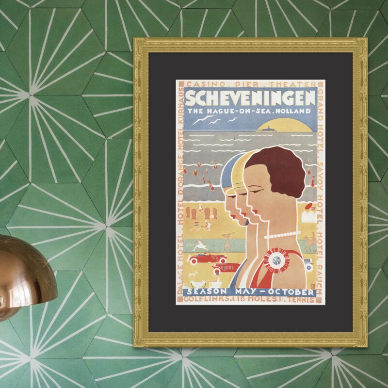
Remember that the frame itself is a part of the display. The matting should not only complement the picture but also the frame. Sometimes, a contrasting frame and mat can be striking, such as a black frame used with a white mat, while other times, a more harmonious color palette is optimal for the overall presentation of the picture.
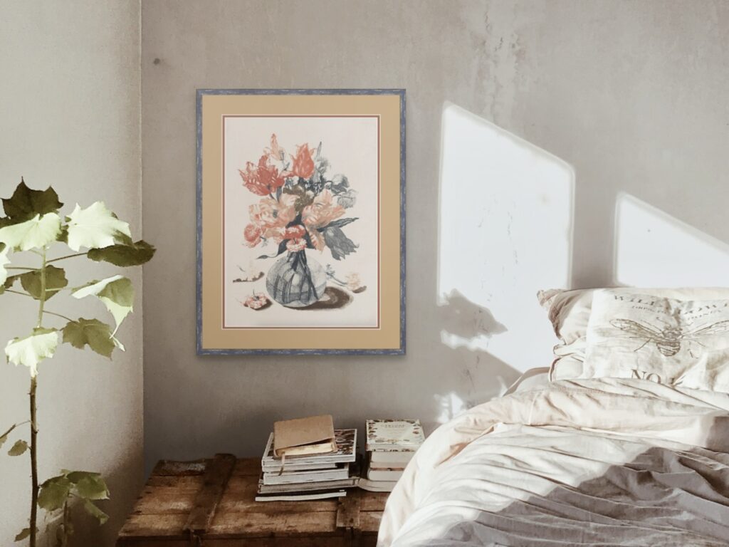
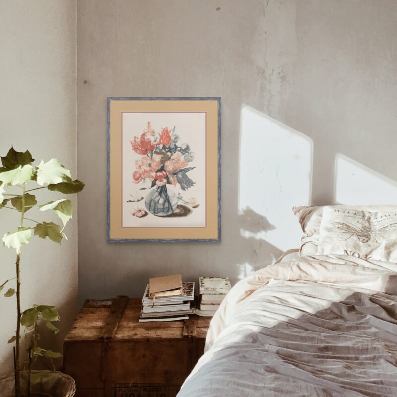
6. Think About the Display Location
Consider the color of the wall and the overall decor where the picture will be displayed. Ideally, the matting should complement not just the artwork and frame but also the surrounding environment. This is particularly important if you hang the frame on a wall with other frames. You’ll need to consider how much consistency in style you want between the collection of pictures on the wall.
7. Textured vs. Plain Matting
Apart from color, mats come in different textures. A textured mat can add depth and character to the artwork, especially if the picture has a more simplistic design or muted colors. A non-textured mat will command less attention, allowing more focus on the artwork.

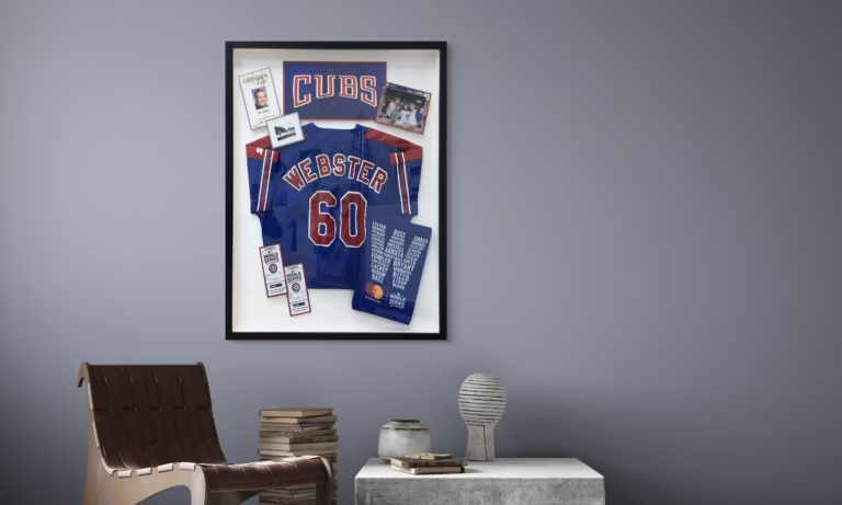
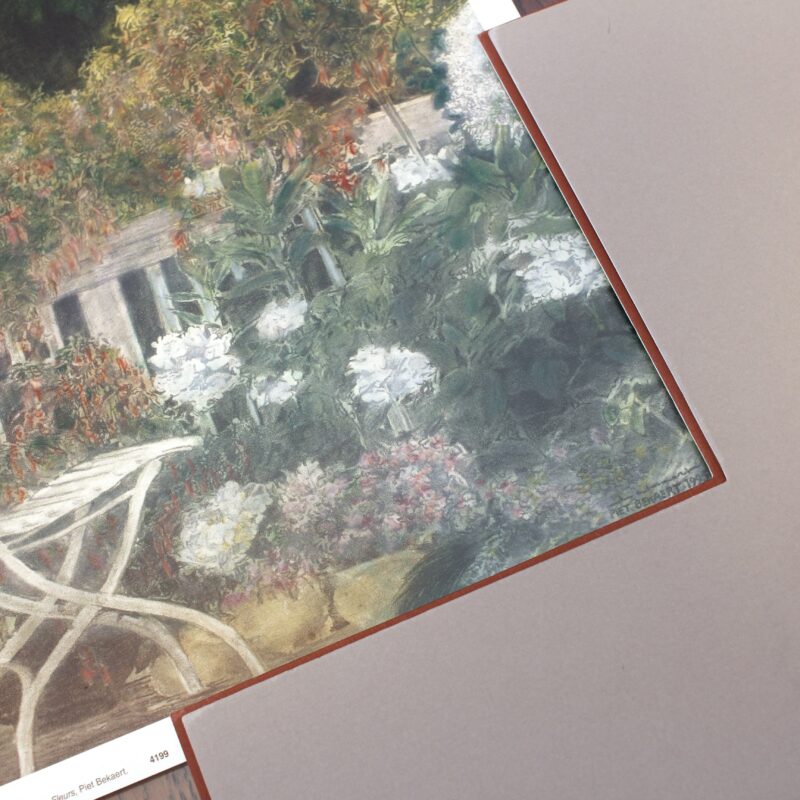
8. Double Matting for Depth
For added depth and a touch of sophistication, consider using multiple mats, which involves using two or three mats. All matting effectively creates a space between the frame glass and the artwork. By using multiple mats, you increase the distance between the picture and the glass, increasing the depth and dimension of the display. Multiple matting allows you to have fun with your matting combinations, such as pairing a neutral color mat with one or more complementary colors.
9. When in Doubt, Seek Advice
It can be quite challenging to visualize the various combinations of matting and frames with your artwork. That’s why it’s nice to see how the various components all come together before you start spending money on the framing. Thankfully, FastFrame offers free design consultations to help with this. All you need to do is visit your local store to get started. Find your nearest store here.