Designer Tips for a Colorful Home
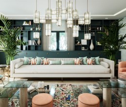
Many of us love the idea of having a colorful home that looks bright, cheerful, and fun! But color can also be intimidating—there are so many options, and what if you pick the wrong one and your living room ends up a horrendous shade of aquamarine? Never fear! If you’re scared of color, we have some great tips for newbies that make it easy to incorporate as much or as little color into your home as you like. With our expert guidance, you’ll be trading gray tones for emerald green in no time!

Go Back to Art Class
Remember learning about the color wheel in art class? The color wheel is made up of primary, secondary, and tertiary colors. Color theory offers easy ways to create harmonious combinations from those colors. The most popular color schemes are: complimentary (colors that are opposite one another), split complementary (main color and two colors on either side of the opposite color), analogous (colors that are next to each other), and triadic (three colors equally spaced around the wheel.) For a more subdued look, you can transform a color by adding white (tint), gray (tone), or black (shade).

Go Back to Art Class
Remember learning about the color wheel in art class? The color wheel is made up of primary, secondary, and tertiary colors. Color theory offers easy ways to create harmonious combinations from those colors.
The most popular color schemes are: complimentary (colors that are opposite one another), split complementary (main color and two colors on either side of the opposite color), analogous (colors that are next to each other), and triadic (three colors equally spaced around the wheel.) For a more subdued look, you can transform a color by adding white (tint), gray (tone), or black (shade).
You can pick up a paper version from an art supply store; a pantone color guide or paint specifier—they’re very handy for choosing colors!
Start Scheming
How do you choose a color scheme? That depends on the look you’re going for. Complimentary colors create a high contrast, so use them when you want a bold statement. You can soften the look by using one hue as the main color and the other as the accent. A split complementary is great for beginners because it’s hard to mess up! You’ll still get contrasting colors, but it will look less extreme than complementary colors. Analogous colors offer a very cohesive palette, but they can be overwhelming in high saturations, so stick to tints for a less intense look. A Triadic scheme is high contrast, but very balanced. The trick is to use one as the dominant color and the other two as accents. You can also opt for a unified monochromatic look which uses different tints, tones, and shades of one hue.
Start Scheming
How do you choose a color scheme? That depends on the look you’re going for. Complimentary colors create a high contrast, so use them when you want a bold statement. You can soften the look by using one hue as the main color and the other as the accent. A split complementary is great for beginners because it’s hard to mess up! You’ll still get contrasting colors, but it will look less extreme than complementary colors.
Analogous colors offer a very cohesive palette, but they can be overwhelming in high saturations, so stick to tints for a less intense look. A Triadic scheme is high contrast, but very balanced. The trick is to use one as the dominant color and the other two as accents. You can also opt for a unified monochromatic look which uses different tints, tones, and shades of one hue.
Swap it Out
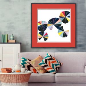
Okay, now you have the knowledge, but how do you actually introduce color into your home? The simplest way is to start with decor that makes an impact, but is easy to swap—think pillows, curtains, and rugs. Textiles are a great, low-commitment way to test out a new color scheme. You can try out a new hue while adding pattern, texture, and warmth to your space—all without breaking the bank! Vases, trays, and potted plants are also good low-cost options for creating a more vibrant space.
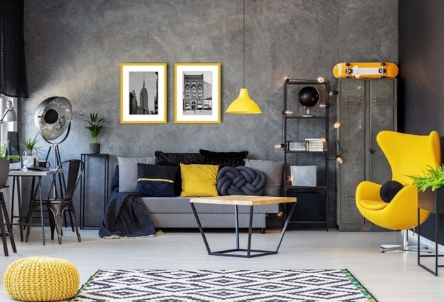
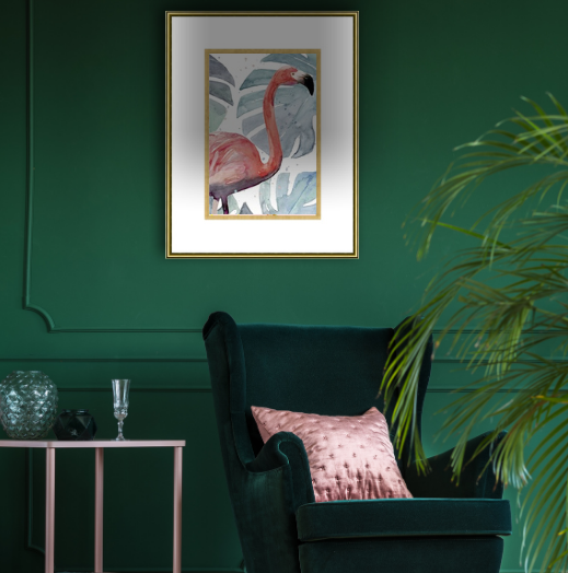
Another great way to add color is by swapping out art in your home. Choose a piece that fits your new palette and make sure to custom frame it so you can add more pops of color with an accent mat and a unique moulding.
Check out your local FastFrame store for our favorite colorful options!
Live With it
Before making a big home decor purchase or painting your walls, be sure to take home fabric and paint samples to see how they look in your space. The trick is to leave the samples in your room for a few days to see what the color looks like in different types of lighting throughout the day. When does your room get used most? Pay extra attention to how the samples look during those times. Remember that natural light has a big impact on how a color looks. Colors tend to look darker in rooms with northern exposure and lighter in rooms with southern exposure, so choose your colors with this in mind!
Live With it
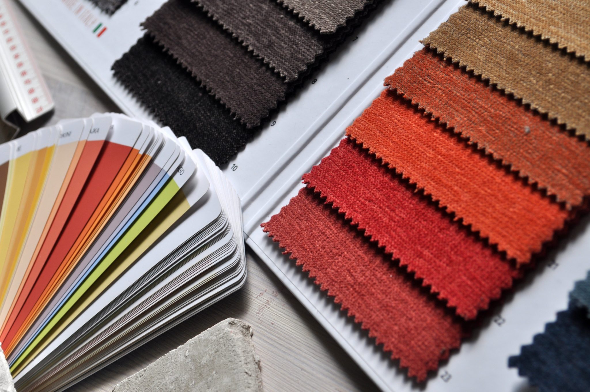
Before making a big home decor purchase or painting your walls, be sure to take home fabric and paint samples to see how they look in your space. The trick is to leave the samples in your room for a few days to see what the color looks like in different types of lighting throughout the day.

When does your room get used most? Pay extra attention to how the samples look during those times. Remember that natural light has a big impact on how a color looks. Colors tend to look darker in rooms with northern exposure and lighter in rooms with southern exposure, so choose your colors with this in mind!
Add Layers
Having white walls and a gray sofa does not make you boring! You can layer in as much or as little color as you like. If you want your room to look more subdued, it’s okay to have neutral hues anchoring your space. You can add pops of color with beautiful custom-framed artwork, vibrant pillows, a patterned rug, an accent chair, and even plants. For a more eclectic look, don’t hold back—paint the walls a cheery hue, hang up a funky gallery wall, go for bold curtains, and get that green velvet sofa! You’ll find that the more you play with color in your home, the more comfortable you’ll feel mixing and matching different elements to create a vibrant space. So give yourself permission to invite color in, and don’t forget to have fun!

Add Layers
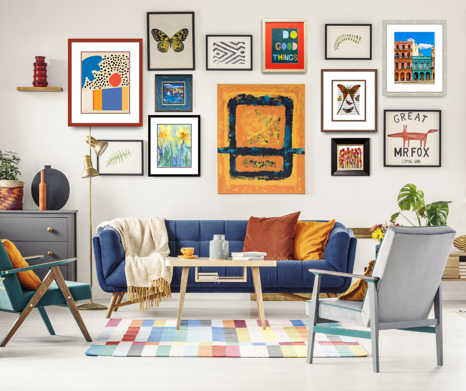
Having white walls and a gray sofa does not make you boring! You can layer in as much or as little color as you like. If you want your room to look more subdued, it’s okay to have neutral hues anchoring your space. You can add pops of color with beautiful custom-framed artwork, vibrant pillows, a patterned rug, an accent chair, and even plants.
For a more eclectic look, don’t hold back—paint the walls a cheery hue, hang up a funky gallery wall, go for bold curtains, and get that green velvet sofa! You’ll find that the more you play with color in your home, the more comfortable you’ll feel mixing and matching different elements to create a vibrant space. So give yourself permission to invite color in, and don’t forget to have fun!
